Batch Job Output Visualisations (HDFS and Hive)
Privitar produces three different visualisations of output data. These visualisations are available from the Job Details section of a Job. Select Manual Generalization or Automatic Generalization to see the charts.
Distortion Measures
Cluster Size Histogram
Cluster Size Bubble Chart
Distortion Histogram
Distortion Measures
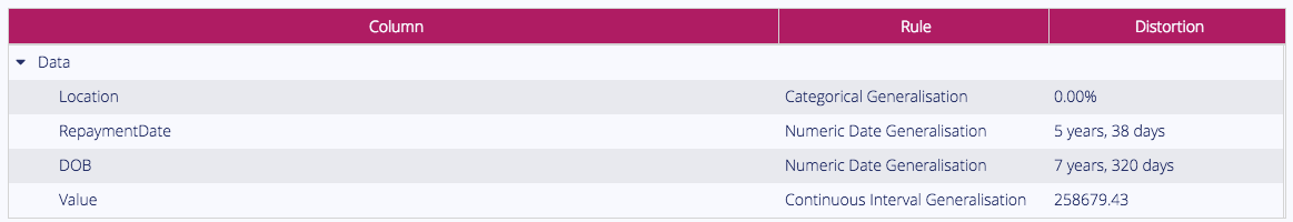
Privitar calculates a distortion measure for each quasi-identifier. This is the mean average error between the original data and the generalized output.
This value is intended to give a high-level summary of the trade-off between utility and privacy that has occurred as a result of the generalization process.
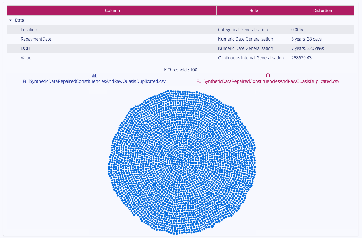
Cluster Size Histogram
The Cluster Size Histogram visualises the distribution of cluster sizes in the output.
Clusters shown in grey do not meet the minimum cluster size threshold. For more information about cluster sizes, see What is k-anonymity?.
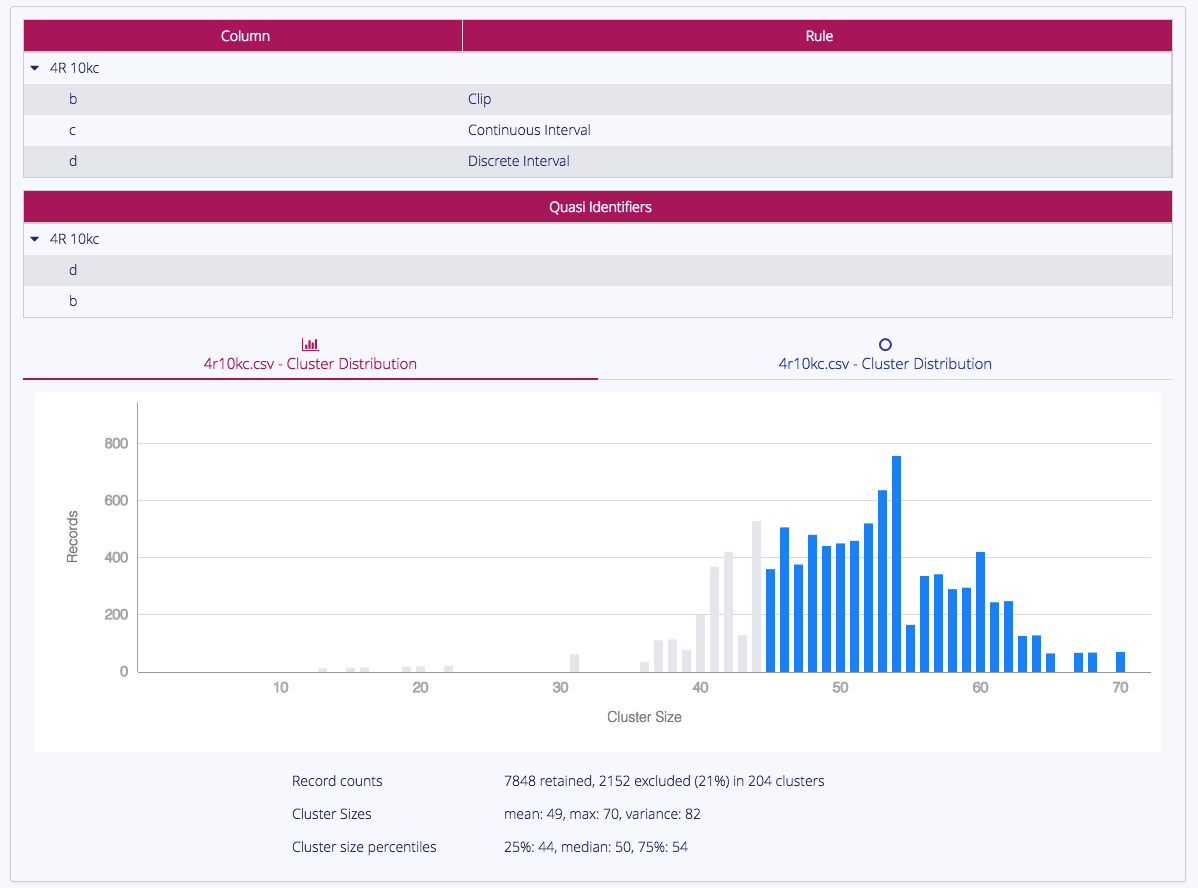
Cluster Size Bubble Chart
The Cluster Size Bubble Chart visualises the relative sizes and counts of clusters in the output.
Clusters shown in grey do not meet the minimum cluster size threshold. For more information about cluster sizes, see What is k-anonymity?.
Distortion Histogram
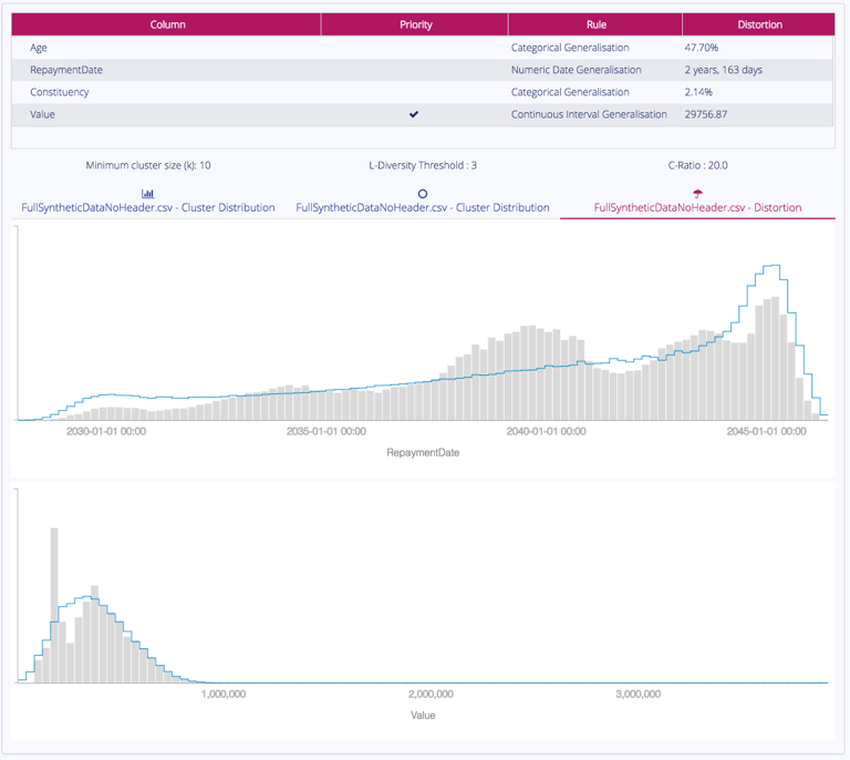
The Distortion Histogram compares the distributions of the original data and the generalized output data.
The original data is shown as the blue line, the generalized output is shown in grey.