What's New in IDMC
- What's New in IDMC
- All Products
 ASK INFAPreview

User interaface changes
| Current behavior
| Previous behavior
|
|---|---|---|
Visual enhancements to the Saved Searches and Templates page
| You can see the following changes on the Saved Searches and Templates page:

| Previously, saved searches and templates appeared in separate panels and the values in the attributes lacked differentiation.
|
Single business entity search
| When you search for records in a single business entity, the name of the business entity appears in the header of the search results page.

| Previously, when you searched for records within a single business entity, the name of the business entity appeared on a tab on the search results page.
|
Icons on record details and search results pages
| On the record details page, you can now see icons that indicate whether a record is valid, is pending approval, has restricted fields, or contains validation errors.
On the search results page, the records display icons that indicate whether the records contain validation errors.
| Previously, the records displayed text labels instead of icons.
|
Visual enhancements to the Source Records page
| You can see the following changes on the Source Records page:

| Previously, you coludn't distinguish master records from source records. Also, the headers didn't remain fixed when you scrolled through the source records table.
|
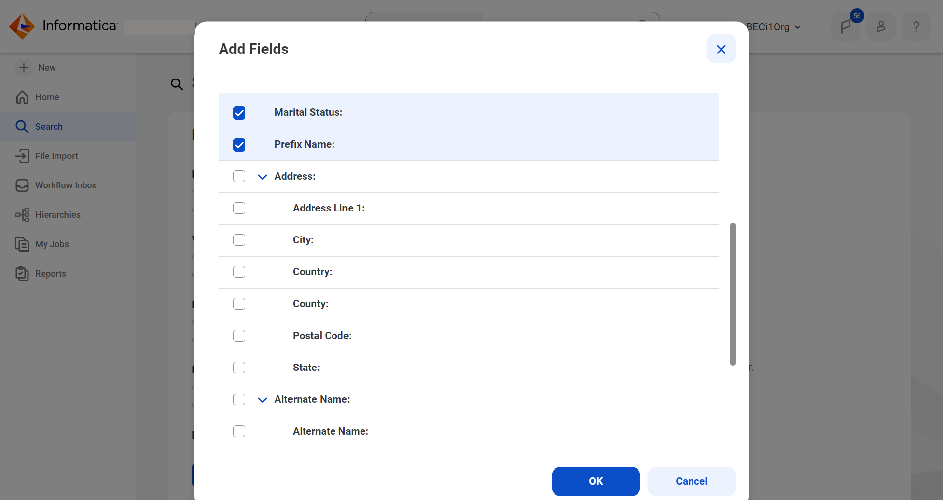
Filtered search
| When you add new fields to a filtered search, you can select fields in the
Add Fields dialog box, but you can no longer enter values to include in your search.
The following image displays the Add Fields dialog box for a filtered search:
| Previously, you could enter values for the fields that you selected to include in your search.
|
User interface element | Current behavior | Previous behavior |
|---|---|---|
Add dashboards | Use the New Dashboard button to create
a dashboard. The following image shows a sample
Home page on which you can create
a dashboard: 
You can also use the Add icon on the
Home page to create a dashboard. The following image shows a sample dashboard page: 
Use the New Dashboard dialog box to
create dashboards. The following image shows a sample New
Dashboard window: 
| Previously, the button and dialog box to create a dashboard
were labeled Add Dashboard . |
Add widgets to a record | Use the Add Report button to add a
report to a dashboard page. The following image shows a sample empty dashboard page:

| Previously, the button to add a report was labeled Add
Widgets . |
Position of legend of a pie chart | You can now view the legend on the right of a pie chart.

| Previously, the legend for a pie chart was displayed below
the chart. |
Edit widgets | Use the Change Report menu from the
Actions menu to edit a widget in
a dashboard. The following image shows a sample page to edit a widget: 
| Previously, the button to edit a widget in a dashboard was
labeled Edit widget . |
Remove widgets | Use the Reset menu from the
Actions menu to remove a widget
from a dashboard. The following image shows a sample dashboard page with an
option to remove a widget: 
| Previously, the button to remove a widget from a dashboard
was labeled Remove widget . |
View dashboards | Use the dropdown option on the Home
page to view the list of dashboards that are available. The following image shows a sample dashboard page with the
dropdown option to view the list of dashboards: 
| Previously, the dashboards were listed horizontally as tabs.
|
Delete dashboards | You can now delete a dashboard from the dashboard
Home page using the
Delete icon beside the
Edit icon. The following image
shows a sample dashboard page with the
Delete icon: 
| Previously, you could delete a dashboard when the dashboard
layout appears in edit mode from the Edit
Dashboard page. Additionally, the
Delete icon was available beside the
Save button. |
View report details | The status icons for the field properties aren't available
now on the Reports page. The following
image shows the statuses of custom reports on a sample
report details page: 
Additionaly, you can now view 25 reports in the
Reports page by default. The following image shows a sample report details page with
pagination: 
| Previously, you could view the status icons for the field
properties on the Reports page.
Additionally, you could view 10 reports in the Reports page by
default. |
View additional report details of a report | In the quick view panel, you can now view a message that
preview for reports created for individual reports is
unavailable. The following image shows a sample report
details page with an individual report: 
| Previously, the message displayed that data wasn't available.
|
Add a chart to custom reports | You can now use the Chart tab to add a
chart to a custom report. The following image shows a sample page to add a chart: 
| Previously, you could use the Configure
Chart button to add a chart to a custom
report. |
Resize report component panel | You can't drag to adjust the data set panel now. The
following image shows a sample report details page: 
| Previously, you could adjust the data set panel. |
User interface element | Current behavior | Previous behavior |
|---|---|---|
Creating a dashboard | Home page to create a dashboard. The following image displays a sample
Home page to create a dashboard:
| Previously, the Home page to create a
dashboard had no illustrations. |
Empty Dashboard | Empty dashboard template. The following image displays an
empty dashboard template: 
| Previously, the Home page to create a
dashboard had no illustrations. |
Report on a dashboard with no data | Dashboard page for a report with no data. The following
image displays a dashboard with a report with no data: 
| Previously, the dashboard with a report with no data had no
illustrations. |
View additional details of a report | In the quick view panel, when there is no data to display in
the report. The following image displays a report details
page: 
| Previously, when there is no data to display in the report,
the quick view panel had no illustrations. |
Create a report. | When you create a report. The following image displays a
sample Reports page with table view: 
| Previously, the page to create reports had no illustrations.
|
Report (Chart View) panel | Before you create a chart, in the Report (Chart View) panel.
The following image displays a sample
Reports page with chart view: 
| Previously, the page to create a chart had no illustrations.
|
Data set panel | When you have no data to display in a data set. The
following image displays a sample report with data set
panel: 
| Previously, an empty data set panel had no illustrations.
|
Report with no data | Report with no data. The following image displays a sample
report with no data: 
| Previously, an empty report page had no illustrations.
|
